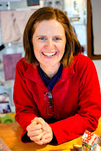
Instructions:
Before Wednesday, March 13, please click on the comments at the end of this post to let me know which three you like the most. If you like the first, second, and fifth, write: 1,2,5* with an asterisk by the one you think should represent me on the brochure. Remember this is likely the ONE image that studio tourists will see and base whether they come to my studio on.
Thank you so much for your help & input!


19 comments:
11, 9*, 1. I'll bring my camera on the 11th and we'll take some more pics! xo
4*, 7, 5 or even one of the aprons like 'Wonky Squares' or Rainbow in your etsy store.
4*, 6, 9 Good luck! XO
What a tough choice! I guess I would go with 4, 9* & 13. But I think one that shows your sewing prowess would be great! The pillows in #5 just look a little lonely for me up on the table.
1* , 4, 9
Super exciting!
4*, 5, 9
Hey, Heather. Great stuff!
4*, 8, 12
Good luck!
diana
2*, 4, 8
I think 1, 4*, 5 to represent a bunch of the different media you use. So hard to choose!
i love them all but my favs are 1,9, 10*. good luck with the studio tour. they'd be lucky to have u! i'm so proud of u my friend! awesome that u're putting yourself out there. love, p
1, 2, 12
Great!
4, 8 and 9 I really like and I'd choose 4 for the cover.
Good luck!
13, 10, 8. Love! -Katie
So hard to decide!
13, 5*, 1
Good luck!
Amy
4, 9*, 13.
my vote is 1*,5,12
It is good to see different styles!
Good luck and much wisdom!
Andrea
13*,12,11
Good luck.
So hard to choose.... I think 3,9*, 12 best reflect your style.
My votes are 3, 9 and 13. But they all look great
Post a Comment