Wednesday, November 20, 2013

Gridded Self-Portrait

This was a project that I put at least 20 hours into and I still could put in another 20 hours to finish! We had to match skin tone square by square by square--a study in color. Each square is one inch.


If you squint, you'll see it looks like a photograph of me!

While I learned a LOT about color mixing, and how there is not one part of a "white" person that is actually white (even teeth and the whites of eyes), I will not be finishing this project. It is agonizingly tedious.  I think I've learned all I can.  

One lesson: my hair color has more brown in it then red! 

I'll admit, it does make for a cool end-result. If you can make it to the end!

Saturday, November 9, 2013

What It Looks Like To Take A College-Level Art Class

Before I started taking an art class, I always wondered what it looks like to take an art class. I never even took an art class in high school (too busy with band and choir, I guess!).  Well, if you're curious, here's what it looks like. This is our classroom. (Remember you can click the photo to make it bigger.)

The wooden things are slats to hold your paintings, board, and paper. In the back are very small lockers that we get to use for the semester. Yes, there is a big poster of Elvis on the door back there. I think that is one of the department's professor's offices.  There are about 20 easels and black chairs and small square tables strewn around the room.  Every day it is a tidy mess.

You'd think with only 16 people in the class and six hours a week of guaranteed time together, we'd all be BFFs by now. Well, not so much. The minute you get there, you take 10 minutes to set up, gesso your paper, make your palette and fill your water container. The teacher talks for 15-20 minutes and then we all get to work. If you're a people person (like me) then you take the occasional break to see what someone else is doing or ask for feedback.  So I am glad to say I feel camaraderie with a majority of my fellow classmates.  That doesn't mean I'm talking all studio-time long. Time management in class has been a big challenge for me. I am always taking things home to finish them!  Here was how my station looked one day a couple weeks ago.

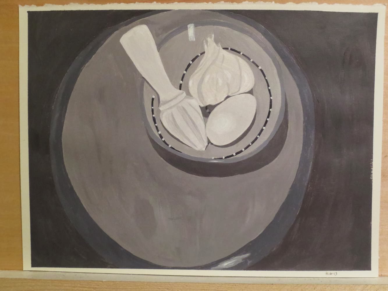
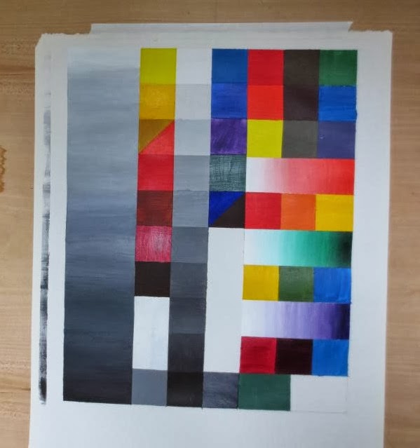
Every once in awhile, we have a critique day.  For the assignment below, we had to create three color palettes, then make three paintings of the same exact thing using the three palettes.  It was a pretty interesting assignment. I'll show you mine in more detail a bit later, but you can see it here, the one on the very bottom. We all hang our pieces up and spend two hours talking about each person's piece.


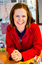
This is my teacher having a closer look!

Here we all are, critiquing.  For the most part, it is very helpful to hear what other's have to say, and it is almost always positive.


Friday, November 1, 2013

Painting Painting Painting!

It's been a busy October with painting for class and a neighborhood art show and studio tour and a trip to the east coast.  I thought I'd finally share some photos of some of the paintings I've made for our class.

My first still life!

Painting "from life" is definitely a new challenge, especially as it had to be in black and white, which meant having to understand it in values. Thank goodness for the monochrome setting on my digital camera! We're working on another one in class right now and it is in color. That throws a whole nother element into the mix which makes it difficult in a different way.

Here is a value chart, a way for us to understand the colors we have in our tubes and practice gradient and tint scales (when you go from white to the color straight out of the tube).  Don't look at the color version yet... can you tell which color is which on the black and white version?  
When you look at the color version, are you surprised?

Here is an exercise we did to learn about high contrast and low contrast. High contrast is when you use all the various grays between black and white on a value scale, including black and white. Here it is in three stages of progress, the third one being "complete":


Low contrast is when you only use 4 grays on the value scale. I used the same photo to paint from, just a different section.  


This one is my favorite of everything we've made so far. The assignment was to take an interestingly-shaped object and paint it several times in a unique and interesting composition.  I found an image of a perfume bottle that I liked the shape and color of.  What you can't see here is that three of the bottles are glazed with gloss medium to look even more like glass.  
The best part?  If you flip it 180 degrees, they all look like hot air balloons, and the one at the top turns into a perfume bottle!  So great!!!!!  Sure wish you could see it in person.