Friday, August 11, 2017

Relief Printing: Color and Meaning


In my last post I concluded that I don't think printmaking is quite for me in the long run. But if you read that post to the very end, you were left hanging, and with an * no less! There was one thing I really loved: relief printing


I found the the complex process of relief to be something I really enjoyed thinking about. There was also more instant gratification than I'd had in intaglio printing. The lino cut piece took just one week, much of it in class! 


Even though it took a month to complete the woodblock design (and that was working on it what felt like day and night), the steps throughout were highly rewarding, and it was great to finally use some color ink.


Woodblock print after the
second of eight colors
I think the aspect of it that I liked most was that even though it was hard physical work (and there was some noise too, when I broke out the Dremel), linoleum and wood were softer, generally quieter materials and the only chemical required was ink.


For the woodblock story, let me start at the beginning.

Our assignment: to somehow use animal imagery in a way that meaningfully connected with our heritage or background.


Hooley the Dog is the only animal I've ever loved in my life, and it turns out that Paul and I happen to own chickens and bees too! So that's where I started, along with a sense of humor (all we need is a goat!), inspired by vintage dishtowels and other chicken art I've made in the last year, and with the desire to integrate text into this project somehow.

While developing my idea with my instructor Johnny, I got to thinking about how chicken farming was what sustained my mom's family as she was growing up in the 50s and 60s. So I texted my aunt, who was really involved on the chicken farm as a kid, and who has taken the concept of farming to a different level on her own large California acreage.

There seemed to be a thread of farming, for various reasons and in various ways, in my very own family.


I drew the above image onto an 18"x30" piece of plywood, and once it was finalized, covered it in shellac to use as a guide throughout the carving and printing process. The first task was to cut away the parts that I wanted to be the color of the paper, white.


Then I covered it in cream-colored ink and printed 7 prints, five on cotton paper and two on cotton fabric (dishtowel theme).


Then I wiped off the cream-colored ink from the wood and started carving away all the stuff I wanted to remain cream on the final print. This meant carving away most of the background, which took several hours. I managed to listen to the entirety of the excellent podcast S-Town over the course of a week while carving, carving, carving. 


I was thinking ahead to the next color: yellow. Looking at my original drawing, there are only a few things I wanted to be yellow: the chicken's legs, the bees wings, and the flowers dotting the background. 

Between each color stage it was more about carving the right stuff off while advancing through my color palette. I had to think ahead and behind at the same time.


Between each layer of ink, the prints had to dry overnight. A perfect time to carve more of the woodblock!


Starting to show some depth with 4 colors:
cream, yellow, light green, dark green.


As the colors progressed the plywood board became less and less recognizable.


Our minimum color requirement was 3 colors. Of course I overachieved. No less than eight colors for me, including light and dark brown, orange, and red.

And here is the final piece (click on it to get a closer view):


The biggest successes are the orange tree and the border (reminiscent of this blanket project I did two years ago in Fibers), and the fact that I managed to keep all the words in tact while carving (hand slippage is very common--you'll notice the dates were scrapped).

I loved that this was the last part of our class, a high note for me to end on. Not only did woodblock relief printing boost my art confidence back up, but it redeemed printmaking overall for me in a meaningful way. I excelled at this process, my professor and TA were very encouraging, and I felt like I spiritually connected my grandfather (note the carving on the tree), aunt, and husband through the common interests we all had/have: the life and work and fun of a farm.

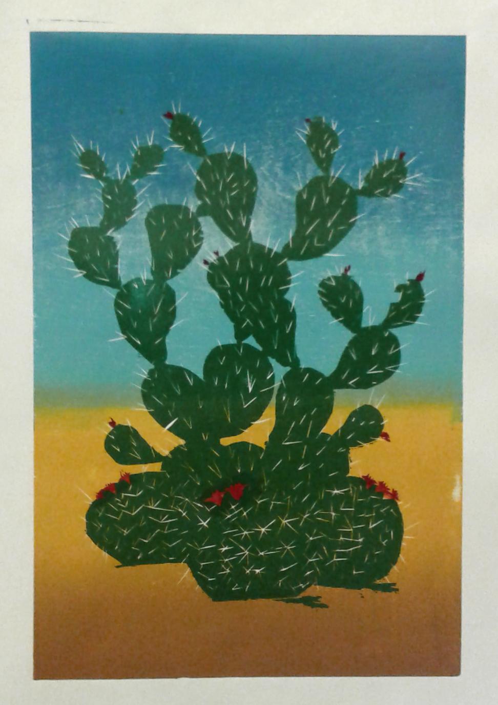
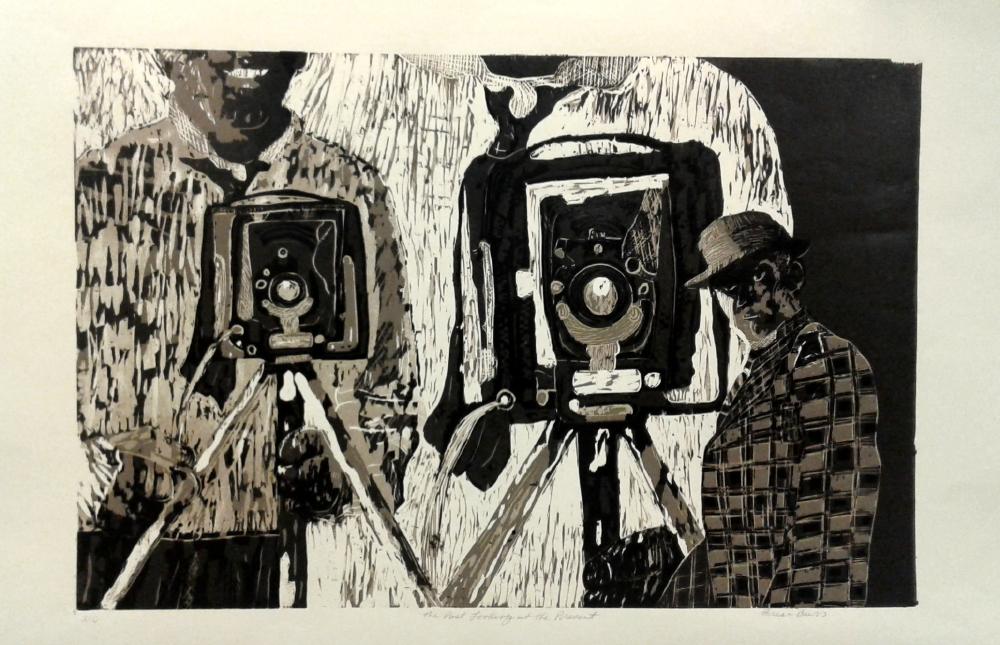
I thought, as a final nod to this topic on my blog, here are some of the other students' prints from this project. Post a comment or send me an email if you'd like to know who made these.


Thursday, July 27, 2017

What Kind of Tedium Do You Like?

Last spring semester, I took a printmaking class at the university. I wanted to take it because I never could quite understand it. Prints, I mean. I'd seen them in museums and wondered--how is that done? What is the process? What about it is artful? I'll admit that I didn't think printmaking was all that. 

Now that I've spent 16 weeks learning it, well, I definitely UNDERSTAND it. More than that, I think it is pretty amazing.

So why might I title this post Tedium?

Preparing the zinc plate for intaglio means
beveling the edges with a file, polishing them,
 and taking off the protective plastic layer.
(Snacks are always close by.)

It has something to do with the fact that this was the hardest studio art class I've ever taken. It's not that the techniques were all that hard, although because I'd never done anything like it before, it was actually harder than usual, especially to attain the standard I'm used to achieving. More than anything, it was the challenge of the process. 

This is a post not so much about what I learned about printmaking, but what I learned about myself because of printmaking.


The first technique we learned was called dry point. After you prepare the zinc plate, you take an engraving tool, a scraper, and other mark-making tools to "draw" a design straight onto the metal. 

This image was inspired by the 40th birthday party
I'd just had, where several of my friends brought
tons of delicious things and lined up
the crock pots all in a row.
Like I said, this whole concept of art-making was completely new to me, so preparing the plate and drawing a backwards image with a metal tool went pretty slow. It was taxing on the body (drawing into metal doesn't have the same ease of flow as drawing on paper, no matter the tool!). The studio was always loud with everyone scraping on their plates and air vents on all the time. There was metal dust and the smells of motor oil and India ink.

Yep, this is the semester that I learned how freaking sensitive I am. In fact, I found myself seeking comfort and constantly second-guessing myself.


Speaking of smells, our second technique turned out to be even smellier: hard ground! Coat the plate in an asphalt-beeswax mix and then scrape away the tar-like coating to reveal the part you'd like to be eaten away in acid.


It wasn't until the third technique that I finally saw a place for me in all this sharpness and hardness and chemicals and noise: soft ground. Finally, a nod to softness and nuanced texture! 

I made this texture collage in my studio at home, talking on the phone with a friend for part of the time and with my speakers playing Amazon Prime's "Liquid Mind" station (yep) the other part of the time. 


Instead on focusing on the visual aesthetic of color and print, I looked at all my materials solely for their textural components. I saw my art room completely anew, totally fresh.

With this technique you press your design into a softer wax coating onto the plate, then let the acid do its work!


To offer more control in the outcome of the final print, you can use multiple techniques. You can see here that I wanted to block the acid in one spot, so I used hard ground.


Here's the plate, with the wax and hard ground washed off, and all inked-up for printing:


And the print result. Pretty cool.


Our final intaglio technique was aquatint. For this one, you have to think backwards, working from light to dark, and it offers a way to do value and tone. I actually like this technique very much on a hypothetical level. I really enjoy challenging thinking processes in art. 

Yet another toxic thing was added to my life for this: resin dust. By now, I had to wear a whole uniform while working in the studio. I was starting to feel like Darth Vader.


The aquatint plate, and the print, below:

All the Letters I Never Write, aquatint print,
Image area 11¾” x 18”, Paper size 18½” x 24½”,
edition of 2 

Here's a photo of some of my printmaking classmates/friends, who loved talking about art and were smiley and encouraging along the way: Mac, Taylor, Zach, and Erin. 


I said before that I find printmaking to be truly amazing. I do. I am really impressed.

I am so grateful to have learned how to do it. My art context has expanded exponentially. Now, I UNDERSTAND printmaking. And I have so much respect for the artists who love it and focus on it, and strive to be excellent at it.

And yet for me, printmaking was simply not soft enough, not quiet enough, and too darn smelly.  There was a "this takes forever" component in the process that wasn't satisfying enough for me. There wasn't enough instantly-gratifying progress (no matter how small) as I proceeded through the process.

Indeed, I declared a fibers concentration this semester. Not that there isn't a certain amount of tedium in weaving or dyeing or hand stitching. It's just that for some reason, my personality and sensibilities don't mind that kind of tedium as much.

As a last hurrah* to printmaking, in case you're wondering how to get the print from the zinc plate to the paper, I made this 3:33 minute video showing the process.


*Well, there was one thing I actually really liked in printmaking (relief printing), but I'll blog about that in the next post. :)

Thursday, July 20, 2017

Celebrating 10 Years: HLM Cardswap

For the 10th year in a row, the 6 Degrees of HLM Cardswap was a huge success! Thanks to the 29 participants, we had a robust year of card-making, with creativity and fun times.

Remember to click on the photos for a closer view!

Starting with the Big Picture, here are 290 cards--wow!!!


Siri, a loyal card swap participant from previous years, actually loves the swap so much that she decided to arrange a contingent of the swap in her home town of State College, PA. She recruited six of her crafty friends, and they got together at a local makery to have an Art Party of their very own, on the same day we had our Card Swap work party here in Colorado! Here are some great photos of their time together, and their cards are below:


Here are Tricia's cards:

Siri used some old international postage stamps as her inspiration: 

 Katie O. did some lovely watercolors:

Erica used watercolor too, but a totally different style:

Each of Bec's cards was a unique acrylic & ink painting:


 Amy F. used layers and collaged her cards:

And Amy B. mixed and matched her styles to create 10 unique designs:

Siri gathered them up and sent them all to me in one box. It was a glorious mail day to receive 70 cards in the mail all in one package!


This year's themes were "ten" and "line." If people found inspiration in the themes at all, they were all unique and wonderful.

Back in Fort Collins, Sue participated once again, using her corrugated cardboard to play on the line theme, and each flower has ten petals:

Shari also played on both themes, with ten birds placed on two clothes lines:


Katie J. used some old slides from her mom's hall closet collection to create interactive cards. She also made her ten cards at the time that she had just given birth to her third child, and got them in before the deadline! I think she deserves extra kudos for that. 


This was Orly's first time in the swap and she turned some of her organic "intuitive" paintings into prints:


Mia used a stamping technique (looks like potato stamps to me) to create three unique designs, which she embellished with thin black ink.


Mary Lu has participated as long as we've known each other, and despite huge life transition, she always delivers something special:


When I delivered Marge's cards to her last year, she was so excited to do it again. You can see that she used several decorative papers with lines as part of their design.


Gaye took photographs of flowers, and found the orange one to be particularly painterly:


Haley used both themes, using ten lines of paper to create her cards:


These are my cards, and I drew six different designs based on the theme of ten. I googled "ten" and brainstormed ways to turn the results into cards one might actually send.


I've known Cydney for four years and finally she had the time (in her last semester of college?) to participate in the swap. She used lines to graphically design a butterfly. She also printed a lot of extras, so some of you got 11 cards instead of ten this year--a fun bonus!


Claudia used line as well, and wove what seem like hundreds of thin lines of paper together:


Laura challenged herself to ONLY use triangles. Her outcome is stunning and also uses the line theme in the negative space:


Andrea's first time in the swap was exciting, something she's not ever done before. She was inspired by a card I made for the 2012 swap and used tons of fun supplies in my studio at the work party to make the design her own, incorporating the line theme. She went from no idea of what to do to twelve cards in 4 hours. Amazing!


Jessie drew this adorable recipe design, based on the number 6. I discovered a month after I received her cards that she loved the theme, six. I told her it was ten and we both had a good laugh.


As for our other out-of-towners, Jenn has moved to Germany and she immediately thought of sheet music when she heard what the themes were. Ten lines in treble and bass clef! She and her 1-year old found some old music, watercolored them, then cut-em-up and collaged them into new music/love designs. 


Speaking of international participants, Ambra from Toronto also participated. We had a Skype work party after the in-person work party was over, and you can see the original collage that she turned into prints for her cards. Unbelievably, her first batch got lost in the mail. Oh no!! So she made a whole nother batch and they arrived JUST IN TIME:


Jennifer lives in Sebastopol, California, and when she heard the theme ten, she thought of the nursery rhyme Ten Little Monkeys. She used a mix of crayons and fabric to create a scene where that cute little story might take place.


This year provided another first for the HLM card swap: our first kid participant! Bronwyn is Jennifer's daughter, aged 8. She has participated in helping her mom make cards in previous years, but seemed ready to make the commitment to doing ten of her own cards this year. She came through with ten unique drawings:


Anne lives in Seattle and used a collection of old European train tickets as her inspiration. She incorporated line by pin-pricking lines into the brown paper, creating a sense of movement and travel and punching the travel tickets.


Kristin lives in Longmont, CO, and each of her colorful flowers were like mosaics. Clearly lots of TLC in each card. 


Last but not least, my step-mom Nancy lives in Portland. She played on the recent coloring phenomenon Zentangles to create "tentangles." She hand drew these geometric designs that played on the number ten:


Here's a fun last photo, of the swapping day with my swap buddies Haley and Harper. 


Thank you again to everyone who participated. Please share this blog post far and wide, and use our hashtag anytime you refer to it. #hlmcardswap

I hope you'll join again next year. 💙